
Rep Metrics Dashboard: Real-Time Insights for 5,300+ Stores
Sales managers at AT&T required a centralized solution to track key performance indicators like activations, upgrades, and accessory attach rates. The existing tools were outdated and disconnected, making it difficult to monitor performance or address underperforming locations effectively.
My Role
I directed the UX efforts of a cross-functional team that included 2 UX designers, 2 product owners, and 6 software engineers, collaborating across all phases of the project to ensure seamless execution and delivery.
Timeline
Discovery & Research: 4 weeks – Conducted user interviews, synthesized findings, and created journey maps to identify pain points and opportunities.
Prototyping & Design: 4 weeks – Developed wireframes and high-fidelity prototypes that addressed user needs and business goals.
Usability Testing: 2 weeks – Facilitated iterative testing to validate design decisions and refine workflows.
Final Handoff & Collaboration: 2 weeks – Partnered with engineers to implement the solution, ensuring real-time data integration and scalability.
Project Overview
In 2024, as the Lead UX Designer, I led the redesign of the Rep Metrics Dashboard. The goal was to create a scalable, intuitive dashboard that prioritized real-time data and actionable insights while addressing the needs of both managers and sales representatives. This project closely aligned with AT&T’s broader strategy to improve operational efficiency and drive nationwide sales.
The goal of this project was to create a scalable, intuitive dashboard that prioritized real-time data and actionable insights, addressing the unique needs of both managers and sales representatives.
By centralizing key performance indicators and streamlining workflows, the redesigned dashboard aligned closely with AT&T’s broader strategy to improve operational efficiency and drive nationwide sales.
Challenges
Sales managers were dealing with fragmented tools that required them to switch between multiple platforms to gather data. This slowed decision-making and left little room for proactive interventions. The lack of real-time updates often resulted in missed opportunities to course-correct during critical sales cycles. Additionally, the overwhelming volume of unstructured data made it difficult to prioritize key metrics, leading to inefficiencies across the board.
This initiative was part of AT&T’s strategic objective to improve operational efficiency for 50,000+ sales representatives and regional managers. The goal was to reduce reliance on fragmented systems and empower teams with real-time, actionable insights to drive sales performance.
Research and Insights
The research phase began with 15 interviews with regional and national sales managers to uncover their workflows, decision-making processes, and pain points. To deepen my understanding, I created a journey map that visualized the complete decision-making process. This map highlighted each stage of their day, from monitoring performance to acting on insights.
Key Insights:
Managers needed real-time insights to make proactive decisions rather than reacting to historical data.
Filtering and benchmarking tools were crucial for identifying trends and outliers.
Visual hierarchies and actionable alerts were necessary to focus on critical data points.
Using these insights, I mapped user flows and prioritized features that aligned with the needs of sales managers while ensuring ease of use for indirect interactions by sales representatives.
User Persona
Regional Sales Managers
Working Environment
Spend most of their day in office settings but often connect with store teams remotely to address performance challenges.
Responsible for monitoring activations, upgrades, and accessory attach rates across multiple stores in their assigned regions.
Technology
Use laptops to access performance metrics and spreadsheets in office settings. Rely on email and fragmented tools to communicate findings and directives.
Pain Points
Data is fragmented across multiple systems, requiring manual consolidation and wasting valuable time.
Lack of real-time updates delays their ability to act on performance issues in underperforming stores.
Key insights are buried under layers of data, making it difficult to prioritize metrics.
Design Process
Without access to AT&T’s internal files, I analyzed their website to align the design with their branding. Metrics from four separate apps, accessible only to managers and sales reps, were consolidated into a single dashboard through close collaboration and weekly feedback sessions.
Regular feedback sessions with regional managers and sales representatives informed key features, such as the inclusion of multi-select filters and real-time updates. These sessions ensured the dashboard directly addressed user pain points.
Usability testing revealed that sales reps completed data retrieval tasks 25%faster with the new filtering system. Iterations based on user feedback further improved navigation and task clarity.
Accessibility was a key consideration throughout the design process. The dashboard adheres to WCAG standards, including high-contrast visuals, keyboard navigation, and screen reader compatibility, ensuring usability for all users regardless of ability.
The dashboard was designed with a modular structure, ensuring flexibility for future enhancements, such as integrating additional data sources or predictive analytics tools.
Wireframes
This primary screen serves as the entry point for managers, providing a real-time overview of performance across 5,300+ branded stores. By default, the screen displays data for all locations, with "All Locations" selected to ensure managers can immediately access a comprehensive view. Donut charts and progress bars dynamically highlight key performance indicators such as activations, upgrades, and accessory attach rates, allowing managers to monitor progress toward goals instantly.

Hight-fidelity prototypes
I designed high-fidelity prototypes in Figma, which were tested with 25 regional managers to ensure the interface met user expectations. Iterative feedback cycles allowed us to refine visual elements and workflows for optimal usability.
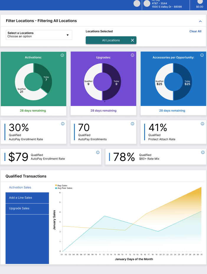
The qualified transactions graph visualizes sales trends over the month, enabling managers to compare performance dynamically.
Impact: Managers could assess organizational performance at a glance, reducing time spent analyzing reports by 35%.
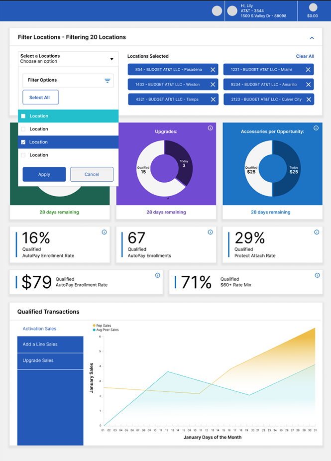
Real-Time Filtering and Regional Benchmarking
This screen features a robust filtering system, enabling managers to refine their views by location, region, or specific metrics. Dropdown menus and checkboxes allow them to drill down into underperforming areas or highlight top-performing stores.
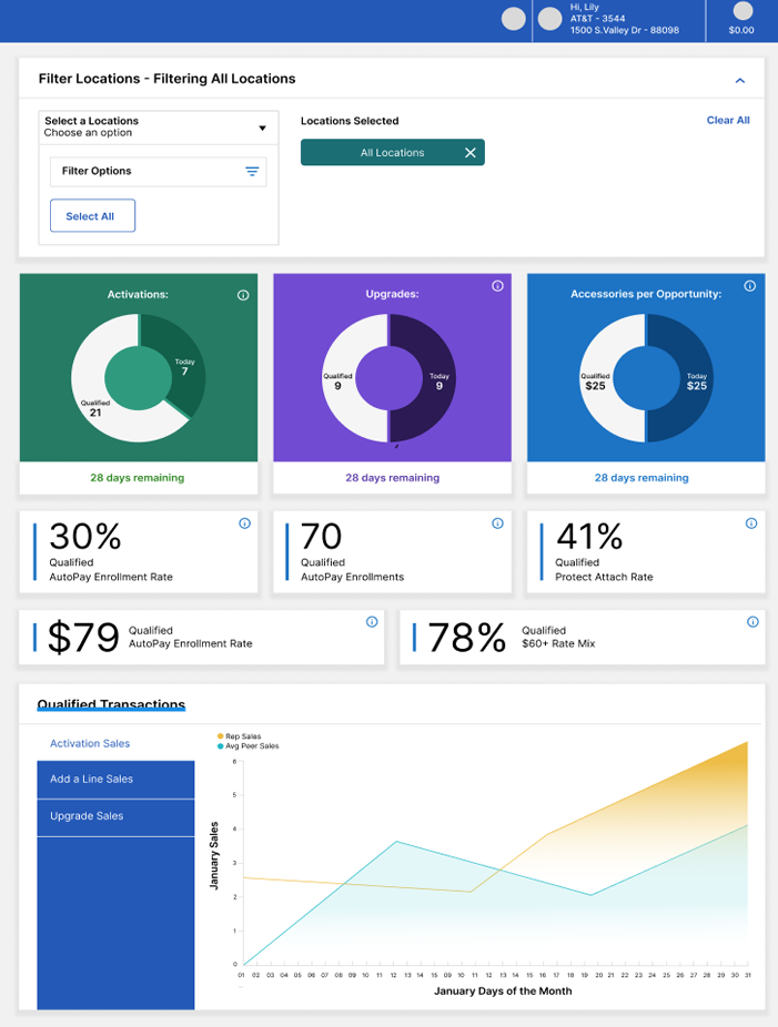
Location Filtering Dropdown for Targeted Insights
The typeahead search functionality within the dropdown menu empowers managers to quickly locate specific locations by typing a few characters, significantly reducing search time. This dynamic feature auto-suggests results as they type, ensuring precision and ease of use.
Key dropdown capabilities include:
- Typeahead Search: :Auto-suggests locations for faster selection.
- Default View: Displays metrics for all 5,300+ branded stores with "All Locations" pre-selected.
- Multi-Select Options: Allows managers to select multiple locations for tailored analysis.
- "Select All" Feature: Enables quick, comprehensive data views.
- Actionable Controls: Clear "Apply" and "Cancel" buttons to confirm or discard changes.
Filters allow users to segment by location, enabling tailored data views to match business needs.

Impact: Filtering tools streamlined access to relevant data, reducing data retrieval time by 30% and improving strategic planning efficiency.
Qualified Transactions Dashboard
A visual dashboard displaying sales metrics, comparing daily Rep Sales to Avg Peer Sales using a line graph. Tabs organize data by category: Activation Sales, Add a Line Sales, and Upgrade Sales.
- Consolidates sales tracking by replacing manual entry and multiple apps.
- Designed to provide real-time insights, allowing sales reps to monitor progress and managers to strategize effectively.
Impact: Consolidating sales data and adding filtering options reduced manual entry by 40%, improved data accuracy, and enhanced performance tracking efficiency for sales teams.
Outcomes and Impact
- 35% Improvement in Decision-Making Efficiency: Managers could quickly focus on high-priority metrics and make real-time adjustments.
- 25% Increase in Actionable Insights: Alerts and benchmarking tools empowered managers to address performance gaps proactively.
- 15% Boost in Sales Performance: Real-time data updates enabled immediate interventions, improving results in key underperforming regions.
- Scalable Adoption: Successfully rolled out to over 5,300 branded stores, supporting a user base of 50,000+.
The redesigned dashboard reduced data retrieval time by 30%, enabling sales representatives to focus more on customer interactions. Managers reported a 25% decrease in the time required to generate reports, streamlining decision-making processes and increasing productivity.
Within three months of rollout, the dashboard achieved an 85% adoption rate among sales representatives and managers, demonstrating its usability and alignment with user needs. This rapid adoption reflects the intuitive design and the platform’s ability to address critical pain points.
Regional managers noted that the dashboard streamlined data analysis, making it easier to identify performance trends.
Reflection and Learnings
This project reinforced the value of real-time insights in decision-making and the importance of user-centered design in driving adoption at scale. By prioritizing research-driven features and iterative testing, I delivered a tool that met the nuanced needs of sales managers while aligning with AT&T’s broader business goals. Key takeaways include:
Real-Time Data is Transformative: Managers rely on instant access to metrics to maintain agility in their strategies.
User-Centric Design Drives Results: Addressing pain points through research and iteration ensured the tool’s success.
Cross-Functional Collaboration is Critical: Close alignment with engineering teams ensured seamless implementation and scalability.
The dashboard was designed with scalability in mind, featuring a modular structure to integrate predictive analytics and additional KPIs as AT&T’s needs evolve.
The modular structure allows integration of predictive analytics and additional KPIs to align with AT&T’s long-term technology roadmap.
The dashboard was designed with scalability in mind, featuring a modular structure that allows for the integration of additional metrics and predictive analytics. This forward-thinking approach ensures the platform can adapt to AT&T’s evolving needs and long-term business goals.
Conclusion
The Rep Metrics Dashboard exemplifies my ability to lead large-scale UX initiatives that deliver measurable business impact. By combining strategic design thinking with a focus on real-time data integration, I created a platform that transformed how AT&T’s sales managers monitor and optimize performance across over 5,300 branded stores. I am eager to bring this expertise to a Lead UX role, driving innovation and delivering exceptional user experiences.