
AT&T
Elevating In-Store Sales Experience
The AT&T disclaimer process faced usability and compliance challenges, creating friction for sales associates and customers alike. Leading this project, I redesigned the interface to simplify mandatory disclaimers and optimize the user journey. The redesign reduced transaction time by 20%, improved sales associate efficiency, and ensured full legal compliance.
Project Overview
Between March and September 2023, I led the redesign of AT&T's "Aktive Now" application, an internal tool used by over 50,000 sales associates nationwide. The primary objective was to enhance the in-store sales experience by streamlining the presentation of mandatory and optional disclaimers, directly improving sales representative efficiency and customer satisfaction. As the UX Lead, I played a pivotal role in aligning cross-functional teams on this project’s vision, and I led the strategic planning, design, and testing phases to address both compliance and user experience requirements at scale.
Challenges
The existing disclaimer process was cumbersome, requiring sales representatives to present multiple disclaimers to customers, often leading to confusion, extended transaction times, and customer frustration. Balancing the legal requirement to accurately present disclaimers while creating an intuitive, efficient user journey that minimized disruptions to the sales process was the project’s core challenge. My role involved not only designing solutions but also facilitating team workshops and discussions to foster alignment on user-centered solutions across departments.
Research and Insights
To inform our design approach, I collaborated closely with legal teams and product managers to fully understand compliance requirements and identify key user pain points. We conducted stakeholder interviews to clarify business priorities and legal obligations, followed by user surveys to gather direct feedback from sales representatives. This research revealed that the existing process was inefficient and difficult to navigate. Insights from usability testing showed that sales associates needed an intuitive, guided process to keep the flow smooth and compliant. These insights underscored the importance of simplifying the interface and creating a guided experience that addressed real-world constraints.
Design Process
Using Figma and Adobe Creative Suite, I led the team in developing wireframes and high-fidelity prototypes. The process began with creating layouts that focused on intuitive navigation and clear information hierarchy. I facilitated design sprints and feedback sessions to ensure alignment among stakeholders and conducted iterative testing sessions with sales representatives to validate and refine the design based on real-world scenarios. User feedback played a crucial role in each iteration, helping us to refine specific interactions, such as how disclaimers were presented and acknowledged, ensuring a smooth flow from plan selection to payment.
Solution Implementation
The redesigned "Aktive Now" app featured a series of screens that guided sales representatives through the disclaimer process:
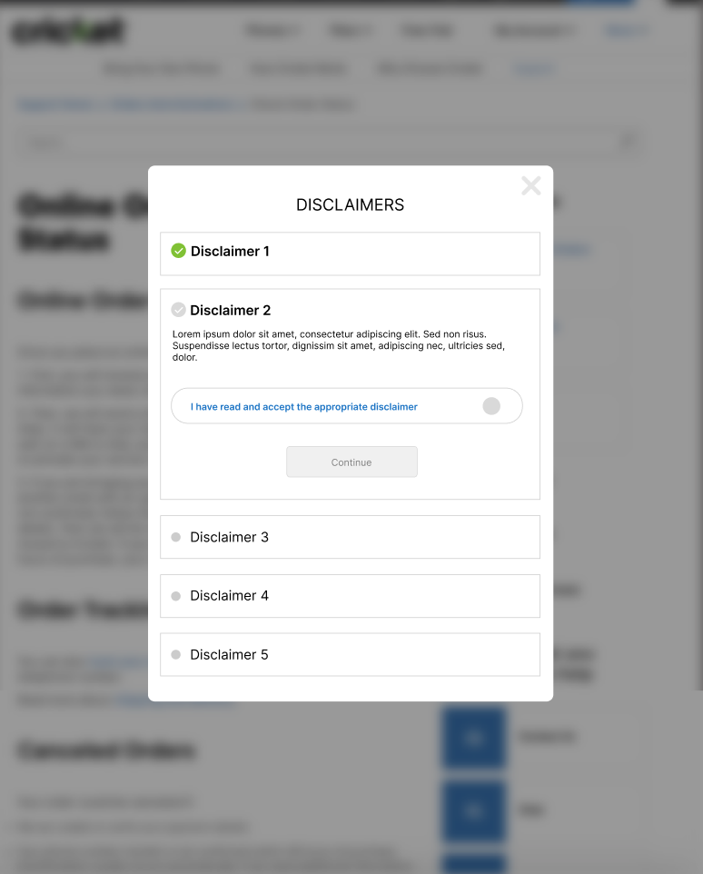
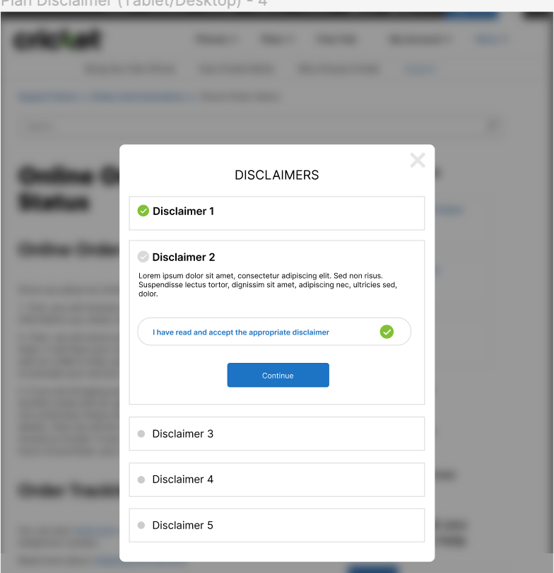
Mandatory Disclaimers
Sales representatives begin on Screen 1, where the first mandatory disclaimer is displayed alongside a checkbox for customer acknowledgment. The "Continue" button remains inactive until the checkbox is selected, ensuring compliance.
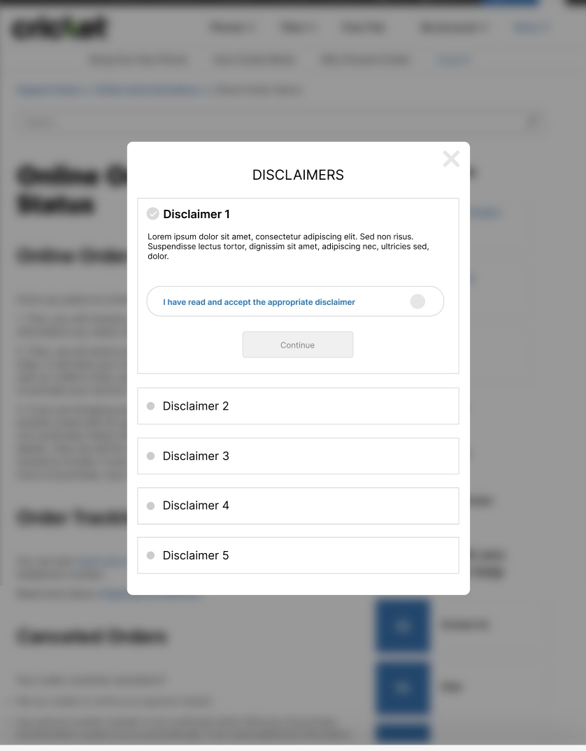
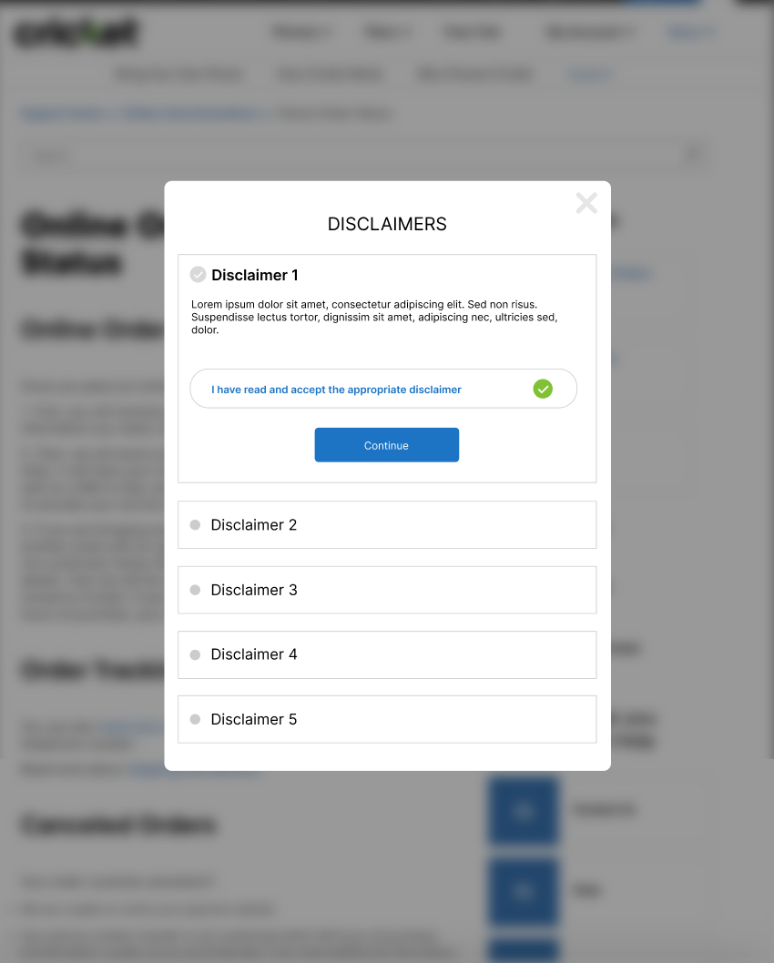
This setup is repeated consistently across Screens 3 and 5, which present the second and third mandatory disclaimers, respectively, reinforcing a structured and compliant approach.
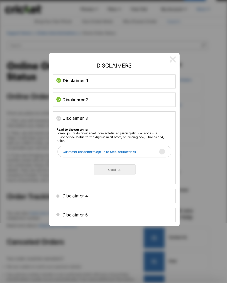
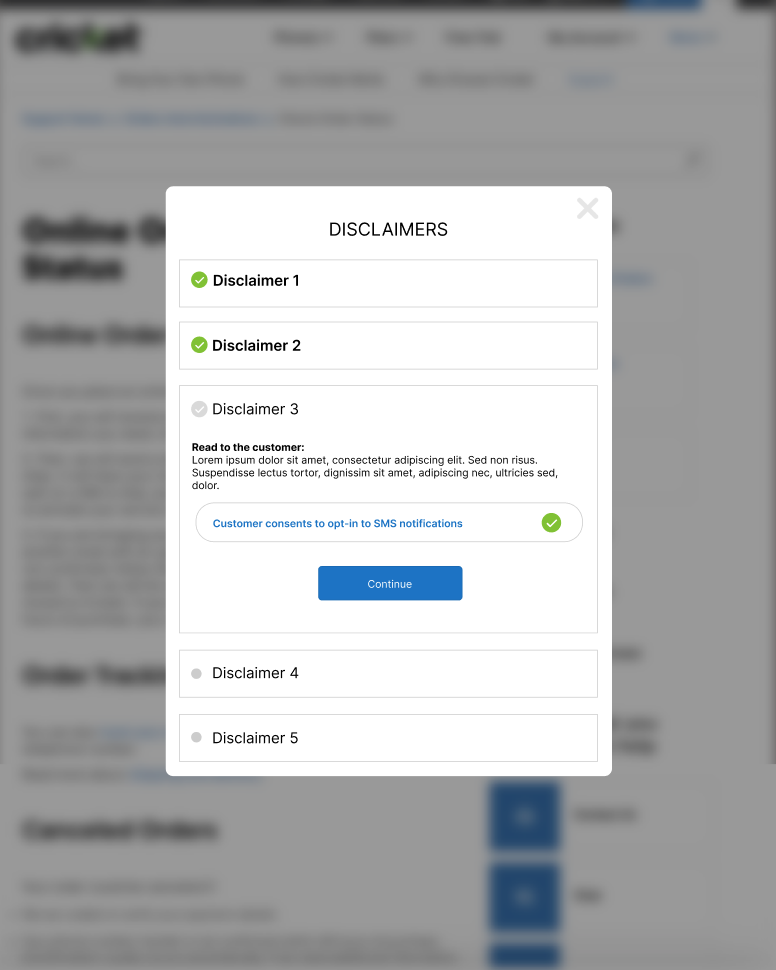
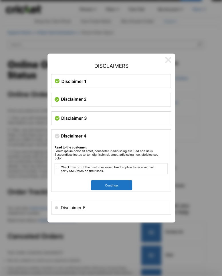
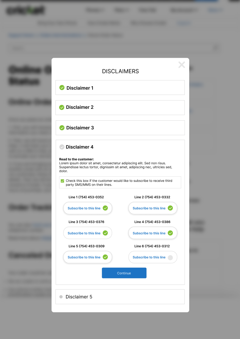
Optional Disclaimers
Following the mandatory disclaimers, sales representatives proceed to Screen 7, which introduces an optional disclaimer regarding special offers or third-party communications. Here, customers are given the choice to opt in voluntarily, with additional options appearing if they select specific lines or services. Notably, the "Continue" button is enabled regardless of the opt-in decision, allowing customers to proceed without mandatory acceptance.
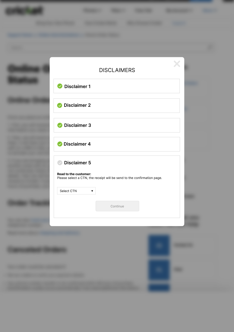
Confirmation Disclaimers
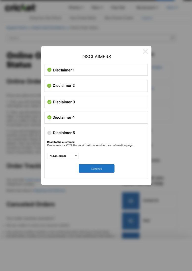
On Screen 9, customers select the CTN (customer telephone number) where they would like to receive their receipt. A dropdown menu allows them to choose their preferred number. This step is mandatory and must be completed to progress further in the disclaimers process.
On Screen 10, after the customer selects a CTN, the previously grayed-out Continue button becomes active (turns blue), indicating that the customer can now proceed to the next step. This ensures a smooth and intuitive user experience while maintaining compliance with the process requirements.
LEADERSHIP ROLE
I led cross-functional workshops with legal, product, and sales teams to address competing priorities and align on key project objectives. By facilitating open discussions, I ensured that compliance requirements were seamlessly integrated into the user experience. Additionally, I managed iterative feedback sessions to refine the design, fostering alignment and ownership across all stakeholders.
Outcomes and Impact
The redesign achieved measurable improvements, with an average transaction time decrease of 20%, enabling sales representatives to assist more customers efficiently. Positive feedback highlighted the app's enhanced usability and clarity, with sales associates reporting fewer issues and a smoother experience. Full compliance with legal requirements was also achieved, mitigating risks and supporting AT&T’s regulatory standards. This overall smoother in-store experience contributed to improved customer satisfaction and loyalty.
Reflection and Learnings
This project highlighted the critical value of cross-functional collaboration, particularly with legal, product, and sales teams, to balance complex requirements with user-centered design. Leading this project reinforced my commitment to a user-centered approach, focusing on practical, scalable solutions that achieve both business and compliance objectives. As the UX Lead, I guided my team by setting a clear vision, facilitating regular cross-functional workshops, and adapting our strategy based on ongoing feedback. This experience underscored my ability to drive cohesive, effective solutions in complex environments, reinforcing my readiness for high-impact leadership roles.
Future Considerations
Looking ahead, there are opportunities to implement further improvements, such as expanding options for customer communication preferences and incorporating data analytics to track and optimize the disclaimers’ performance over time. These enhancements would provide deeper insights into customer preferences, driving continuous improvement in the customer experience.
Conclusion
The successful redesign of the "Aktive Now" app, which impacts over 50,000 sales associates across AT&T stores, demonstrated my ability to lead complex UX projects that deliver measurable business value. I look forward to applying this strategic, results-driven approach in future leadership roles, bringing impactful, user-centered solutions to top-tier organizations.