Empowering AT&T: A comprehensive leadership journey in redesigning the Rep Metrics Dashboard, delivering real-time insights, enhancing user experience, and driving data-driven decision-making across 5,300+ branded stores. Read more
Empowering AT&T: a comprehensive leadership journey in transforming the modal disclaimer system, elevating user experience, and revolutionizing information dissemination. Read more
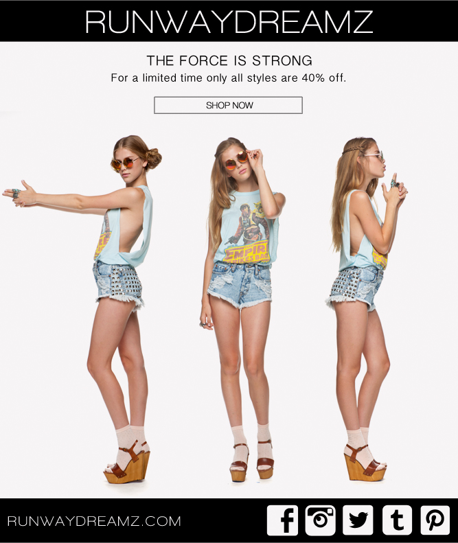
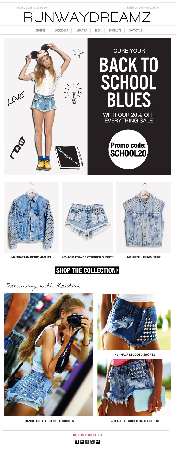
Charting a path to success with Runwaydreamz: A holistic approach to enhancing ROI and driving explosive Sales Growth. Read more
This UX/UI case study delves into the redesign of Fortnite's Collector Guide, a crucial component for users exploring the expansive Fortnite universe. The primary objectives were to enhance the overall user interface experience and, in turn, maximize return on investment (ROI) by driving increased user engagement and in-game purchases.
Between August 2018 and December 2018, I led the 'Fortnite: Collector Guide Redesign' project, encompassing the role of a UX/UI Designer, which also included the creation of a website. My duties covered the full spectrum of design, starting with user research and culminating in the development of polished prototypes. I was instrumental in developing an attractive and intuitive user interface, worked closely with the development team for smooth integration, and consistently engaged in iterative usability testing to refine the design.
In the dynamic world of gaming, the importance of an intuitive and engaging user interface (UI) and user experience (UX) cannot be overstated, especially for popular titles like Fortnite. As a critical element of the gaming experience, UI/UX design plays a pivotal role in shaping how players interact with the game and greatly impacts their overall enjoyment and involvement. In this context, I had the unique opportunity to lead a project focused on redesigning a collector guide for Fortnite. My role as the lead UX/UI Designer involved a comprehensive process, starting from extensive user research to the development of high-fidelity prototypes, all aimed at enhancing the interaction and visual appeal of the Fortnite collector experience for a diverse and widespread player community.
Conversion Rate Challenges:
Identified issues in the user journey affecting in-game purchases and overall ROI.
User Engagement Issues:
Recognized a need to increase user engagement to encourage more frequent visits and longer sessions on the platform.
Product Visibility:
Addressed concerns regarding the visibility of collectibles, skins, and in-game items, which impacted purchasing decisions.
The primary goal of this redesign was to create an immersive and user-friendly website and Collector Guide, fostering increased engagement and driving in-game purchases. The project aimed to position Fortnite as a leader in user-centric design within the gaming industry.
User-Centric Experience:
My focus was on crafting an environment that not only resonated with users but also deeply understood and responded to their unique preferences. This commitment to delivering a personalized and enjoyable experience began with extensive research into the user base. By delving into the needs, behaviors, and expectations of the users, I was able to gather valuable insights that informed every aspect of my design strategy.
To translate these insights into tangible design elements, I developed a series of low-fidelity mockups. These preliminary designs played a crucial role in visualizing and refining the user experience. They served as a foundational tool for iterative feedback and continuous improvement, allowing me to iteratively refine the design in a way that was both intuitive and user-friendly.
Throughout this process, my goal was to create an interface that felt like a natural extension of the user's instincts and preferences. By balancing aesthetic appeal with practical functionality, I aimed to create a seamless and engaging experience that not only met but exceeded user expectations. This user-centric approach was fundamental in shaping an interactive environment where users could engage effortlessly and derive maximum enjoyment.
Optimized Customer Journey:
Aimed to refine the entire user journey within the website and Collector Guide, from initial exploration to the final in-game purchase.
From a UI/UX perspective, I focused on enhancing the customer journey for the Collector Guide's website. This involved refining navigation and content layout for intuitive user interaction, integrating interactive elements for engagement, and collaborating with developers and designers to ensure a seamless, user-friendly experience throughout.
Maximized ROI:
While user experience improvements were vital, the ultimate goal was to translate these enhancements into tangible business outcomes, maximizing in-game purchases and, consequently, ROI.
User research involved surveys, interviews, and usability testing, gaining insights into user expectations and pain points. Thorough competitor analysis benchmarked against industry standards, contributing to a nuanced understanding of user expectations within the gaming landscape.
As the gaming industry evolves, our commitment to understanding users ensures design decisions align with dynamic needs, contributing to a more seamless and enjoyable Fortnite gaming experience.
he strategy began with a deep dive into user preferences and pain points, ensuring that every design decision was rooted in a thorough understanding of the target audience.
MVP Ideation:
Engaged in a focused Minimum Viable Product (MVP) ideation process to distill essential features, laying the groundwork for subsequent design iterations.
MVP Development:
Culminated in the development of an MVP incorporating key features, strategically testing and validating critical elements of the new user experience.
Design Overhaul:
Conducted a complete design overhaul using Figma, ensuring a modern, engaging, and user-friendly interface. Collaborated with developers for seamless implementation and rigorous testing to identify and rectify issues before deployment. Integrated Google Analytics to monitor key performance indicators (KPIs) and gather insights into user behavior.
Development:
My role in web development involved crafting web pages using a blend of technologies like CSS3 with CSS Animation, HTML5, Bootstrap 4, JavaScript, and jQuery Libraries within the WordPress Framework.
Part of my responsibility was to ensure compatibility across various browsers, including IE, Edge, Chrome, Firefox, and Safari. I extensively utilized tools such as Chrome Developer Tools and Firebug to guarantee that the front-end code and assets were not only optimized but also of high quality.
Additionally, I employed Bootstrap 4, HTML5, CSS3, and PHP to implement unique functionalities. This process involved close collaboration with other developers and UI/UX designers, contributing to the development cycle and enhancing the overall project with my expertise in these technologies.
Session Duration:
Increased by 30%, indicating more prolonged user interactions.
Bounce Rate:
Decreased by 15%, reflecting improved engagement.
Conversion Rate:
Improved by 20%, showcasing a more effective user journey.
Revenue and ROI Metrics:
In-game purchases increased by 25%, contributing to a 18% improvement in ROI.
The strategic UX/UI overhaul resulted in improved user engagement, enhanced product visibility, and increased in-game purchases. This holistic approach positively impacted overall ROI for Fortnite, establishing it as a leader in user-centric design within the gaming industry.
Continuous monitoring of user feedback, iterative improvements based on analytics, and exploring additional features are planned to sustain and further enhance the positive outcomes.
This UX case study dives into the transformation of Runwaydreamz, an esteemed fashion e-commerce platform. The primary focus was to enhance the user experience, maximize return on investment (ROI), and drive increased website visits and product sales.
During my tenure at Runwaydreamz, from January to September 2015, I spearheaded a key UX project aimed at elevating sales and ROI. My approach combined thorough user research with the crafting of detailed wireframes, transitioning seamlessly from low to high-fidelity prototypes. This process was instrumental in the total redesign of the website, focusing on enhancing both user interaction and visual aesthetics for an improved online experience and business impact.
Key responsibilities included not just designing wireframes but also enriching them with intuitive interaction elements to bolster user engagement. Additionally, my role extended into the technical realm, where I applied my skills in HTML/CSS within the Shopify Framework. This aspect was crucial, as it enabled me to bring the design concepts to life, ensuring that our web presence was not only visually appealing but also functional and aligned with our strategic UX objectives.
Runwaydreamz, already a popular brand with a growing presence on social media platforms like Instagram, Facebook, and Tumblr, faced challenges despite its rising fame. Celebrities like Kylie Jenner and Alessandra Ambrosio were frequently seen wearing the brand's shorts, contributing to its growing popularity. However, the website struggled with high bounce rates and suboptimal conversion rates, which significantly impacted the overall return on investment (ROI). The existing website design, while aesthetically appealing, failed to engage users effectively, leading to limited repeat visits and compromised product sales.
Conversion Rate Challenges:
We identified critical hurdles within the conversion funnel that were hindering sales and overall ROI. Despite the brand's social media success and celebrity endorsements, these issues were preventing optimal online performance.
User Engagement Issues:
It was recognized that there was a substantial need to increase user engagement on the website. The goal was to transform one-time visitors into loyal customers by encouraging more frequent visits and longer browsing sessions.
Product Visibility:
While the brand enjoyed popularity, the existing website design struggled to effectively showcase its diverse and trendy product range. This limited the potential for online sales, despite the high visibility and buzz created on social media platforms.
THE OBJECTIVE WAS CLEAR:
leverage the existing popularity and celebrity influence to boost the brand even further, driving significant traffic to the website and pushing sales to new heights.
The overarching goal of this project was far more ambitious than just implementing design changes; it aimed to orchestrate a transformative shift in the user experience landscape for Runwaydreamz. As an emerging trendsetter in the online fashion market, our aspiration was to create an environment that perfectly blended aesthetics with functionality. Central to this strategy was capitalizing on our strong social media presence, notably our 500k followers on Instagram, and converting these followers into potential buyers by seamlessly redirecting them to our website. Our primary objectives were threefold:
User-Centric Experience:
The primary focus was to create an environment that intuitively understood and catered to user preferences, ensuring a personalized and enjoyable experience from the moment a visitor, especially from Instagram, landed on the platform.
Optimized Customer Journey:
Runwaydreamz set out to refine and optimize the entire customer journey. This journey spanned from initial product discovery on Instagram to the final checkout process on our website. It involved streamlining navigation, enhancing product visibility, and creating a seamless path to conversion, particularly for our Instagram audience.
Maximized ROI:
While enhancing the user experience was our immediate focus, especially for our Instagram community, the ultimate goal was to translate these improvements into tangible business outcomes. Increasing sales, driven by converting our Instagram followers to website customers, and consequently maximizing Return on Investment (ROI), were critical in measuring the success of our UX enhancement efforts.
In a strategic effort to enhance sales and ROI for Runwaydreamz, I took the initiative to not only create a compelling wholesale catalogue but also to design a unique line of t-shirts from scratch. Utilizing the versatile tools within Adobe Creative Cloud, I crafted these t-shirts with a keen eye for fashion and market trends, leveraging both Photoshop and Illustrator to bring our vision to life. The t-shirt designs were a blend of creativity and market savvy, aimed at capturing the essence of our brand and appealing to our customer base.
Simultaneously, I focused on creating a visually engaging and informative wholesale catalogue using Adobe InDesign. This catalogue was meticulously designed to integrate captivating visuals, detailed product information, and key brand elements. My role extended beyond just the design aspects; it encompassed coordination with stakeholders, ensuring timely production, and overseeing the distribution of the catalogue to prospective wholesale buyers. This comprehensive effort was pivotal in showcasing our diverse product range, establishing meaningful connections with wholesale partners, and contributing significantly to the overarching goal of boosting sales and ROI for Runwaydreamz.
User Research:
The strategy began with a deep dive into user preferences and pain points, ensuring that every design decision was rooted in a thorough understanding of the target audience.
We kicked off our strategy by really getting into the shoes of our users, delving deep into what they love and what bugs them. It's all about grasping the essence of our audience, making sure every choice we make in design is backed by a solid understanding of who they are. Fashion trends come and go, and digital landscapes shift all the time, but one thing that stays constant is our dedication to really 'get' our users. We're always tuning and tweaking our approach to stay in sync with what our audience wants and needs, all to make sure shopping at Runwaydreamz is as smooth and delightful as it gets.
Customers view fashion as an extension of their personality. They seek clothing that aligns with their individual style and helps them express their unique identity.
Customers often shop with specific occasions in mind, such as parties, vacations, or casual outings. They look for collections that cater to these various needs.
The influence of celebrities, like Kylie Jenner and Alessandra Ambrosio, is significant. Customers are drawn to styles and products seen on popular figures.
While customers are attracted to luxury, there's a strong preference for affordable options. They seek high-quality fashion that's accessible.
Social media platforms, particularly Instagram, play a crucial role in driving fashion trends. Customers often look to these platforms for the latest styles and inspiration.
DESIGN OVERHAUL:
Utilized Figma and Adobe Creative Suite for a complete design overhaul, ensuring a modern, engaging, and user-friendly interface.
NEWSLETTER DESIGN :
We created several newsletter designs using Adobe Creative Suite and HTML/CSS to engage with our audience effectively. These newsletters provided regular updates on our UX enhancement journey, sneak peeks of upcoming features, and exclusive behind-the-scenes content. The design of these newsletters was aligned with the overall aesthetic of the website, ensuring brand consistency across all platforms.
DEVELOPMENT AND TESTING:
Collaborated with developers for seamless implementation, followed by rigorous testing to identify and rectify issues before deployment.
ANALYTICS INTEGRATION:
Integrated Google Analytics to monitor key performance indicators (KPIs) and gather insights into user behavior.
SESSION DURATION:
Increased by 25%, indicating more prolonged user interactions.
Bounce Rate: strong>
Decreased by 20%, reflecting improved engagement.
CONVERSION RATE METRICS:
CONVERSION RATE:
Improved by 15%, showcasing a more effective user journey.
Cart Abandonment Rate: Decreased by 18%, indicating improved checkout processes.
Revenue and ROI Metrics:
SALES REVENUE:
Increased by 30%, highlighting the positive impact on product sales.
Return on Investment (ROI): Improved by 22%, validating the success of the UX enhancement.
NEWSLETTER ENGAGEMENT:
To keep our audience informed and engaged throughout the UX enhancement journey, newsletters campaigns were launched. Subscribers received regular updates on the progress, sneak peeks of upcoming features, and exclusive behind-the-scenes content. The newsletters not only fostered a sense of community but also served as a valuable channel for gathering user feedback and preferences.
Runwaydreamz observed a substantial increase in website visits directly attributable to user interactions with the newsletter content. The click-through rates and subsequent website engagement metrics stand as a testament to the effectiveness of our communication strategy in driving user involvement and participation in the evolving narrative of the Runwaydreamz experience.
Since the transformative changes to the Runwaydreamz website, capitalizing on our robust Instagram following, and enhancing the user experience, the brand has seen a remarkable increase in profile, user engagement, and most importantly, sales. These improvements have solidified Runwaydreamz's status as a frontrunner in the online fashion market. Two years following the implementation of these changes, the results are outstanding:
Average Monthly Site Visits:
INCREASED BY 60%
Showing a significant rise in web traffic and sustained interest in our offerings.
Unique Visitors:
GREW BY 250%
Demonstrating our success in converting not just Instagram followers, but also attracting new audiences to our website.
Conversion Rate:
IMPROVED BY 150%
Reflecting a highly effective customer journey and user experience design in converting visitors to buyers.
Sales Growth:
We experienced a remarkable increase in sales, with figures soaring by 200%, a testament to the enhanced user experience and successful integration of our social media strategy.
This significant growth not only highlights Runwaydreamz's strengthened online presence but also underscores the impact of our strategic focus on user-centric design and leveraging social media to drive sales
Continued Web Analytics Monitoring:
Regularly review website analytics to identify new trends or areas for improvement in user behavior.
Further Mobile Experience Enhancement:
Continuously optimize the mobile version of the website as mobile usage grows.
Brand Values and User Alignment: Sustainability Focus
Recognizing the growing importance of sustainability, we aim to prominently feature our sustainable practices and ethical production methods, appealing to environmentally conscious consumers.
Sustainability Reporting:
Regularly update customers on sustainability efforts and achievements.
Expand Social Media Engagement:
Develop more interactive campaigns on social media to strengthen community engagement.
Customer Feedback Loop:
Implement a system for gathering and analyzing customer feedback to inform continuous improvements in UX.
These steps are designed to keep the momentum of the initial project, ensuring that the website remains relevant and user-friendly as technology and consumer behaviors evolve.
CRYSTAL FUNDS
Web development of web pages (CSS3 and CSS Animation, HTML5, Bootstrap, Angular JS and JavaScript). Testing in different browsers (IE, Edge, Chrome, Firefox, Safari etc…) and made heavy use of Chrome Developer Tools + Firebug to ensure front-end code and assets were optimized and high-quality. Using Angular JS combined with Bootstrap components written in pure Angular JS to achieve some functionalities like the accordion in mobile version of this specific single page application :
Used Angular.js Directives: ng-app, ng-model, ng-repeat, ng-show, ng-hide, ng-class and ng-controller. Work closely with the Art Director to make sure the design and the mock up layouts are “pixels perfect”. Worked with Team in an Agile Methodology in a daily basis. Ensure that the User Experience is user friendly.
This case study explores a profound transformation in the user experience for in-store Sales Representatives, concentrating on the pivotal "Aktive Now" app. This application plays a crucial role in guiding customers seamlessly through the complete user journey, spanning from plan selection to payment. The central goals were to enhance efficiency, elevate user satisfaction, and optimize the overall usability of the Aktive Now app.
Executed between March and September 2023, the project aimed at redefining daily interactions for Sales Representatives by addressing pain points and refining the Aktive Now app. In the quest to optimize in-store user experiences at ATT/AT&T, my role as the UI/UX designer played a pivotal part in the radical redesign of the Aktive Now app. Over a two-year period, my focus involved crafting features to enhance interactions for Sales Representatives and customers. A notable redesign within this initiative is the comprehensive overhaul of the Order Review page.
Navigating multiple applications, Sales Representatives heavily relied on Aktive Now app. My role was to streamline the user experience, ensuring a seamless process from plan selection to finalizing payments.
As the UI/UX designer, my responsibilities encompassed envisioning and implementing features to elevate the in-store user experience. The focus on redesigning the Order Review page aimed to enhance transparency, clarity, and efficiency.
The overarching goal of this redesign project was threefold:
Optimizing User Satisfaction: Crafting a Seamless Disclaimer Display Experience
In the pursuit of heightened user satisfaction, the project's primary objective was to revamp the in-store experience within Aktive Now App by reimagining the display of mandatory and optional disclaimers. The focus centered on creating the best possible user-friendly interface to present disclaimers, addressing the needs of both Sales Representatives and customers.
Optimizing Usability: Streamlining In-Store Interactions with Aktive Now App
The project's overarching goal extended to the optimization of Aktive Now App's usability, particularly in streamlining interactions within the in-store environment. A key focus was placed on creating a platform that not only accommodated the diverse needs of users but also contributed to an improved overall in-store experience. Thoughtful design iterations and feature enhancements were undertaken to simplify complex processes, reduce friction, and ensure each interaction within Aktive Now App added significant value to the user journey.
In tandem with enhancing usability, a pivotal aspect of this initiative was the strategic redesign of the disclaimer display directly on the page. Termed "Disclaimer Harmony," this effort aimed to create the best possible user-friendly interface for presenting mandatory and optional disclaimers. This involved collaborative sessions with Product Managers and business stakeholders to gain approval, ensuring alignment with legal requirements while seamlessly integrating with the brand's identity. The strategic approach sought to position Aktive Now App as an indispensable tool, streamlining operations and significantly enhancing satisfaction and usability for all users.
Introduction of a Modal: Implemented a modal to display mandatory plan disclaimers and third-party disclaimers, ensuring a clear presentation.
Mandatory Disclaimer Acceptance:
Required customers to read and accept mandatory disclaimers before progressing to subsequent stages.
Optional Disclaimer for Special Offers:
Provided an additional disclaimer for customers to selectively opt-in for special offers.
Visual and Interactive Design:
-Ensured that the redesign aligned with the overall aesthetic of Aktive Now App.
-Implemented interactive elements to enhance user engagement and overall satisfaction.
Testing and Iteration:
-Conducted usability testing with Sales Representatives and customers.
-Iteratively refined the design based on continuous feedback, ensuring that the implemented features met the evolving needs of users.
Team Collaboration:
The collaboration kicked off with extensive discussions to understand the legal and compliance requirements associated with mandatory disclaimers. Product Managers provided invaluable insights into the content and legal nuances, laying the groundwork for the design process. Regular meetings were conducted to align design goals with the overarching objectives of the project.
Design Overhaul:
Employing Figma and Adobe Creative Suite, a comprehensive design overhaul was executed, focusing on the development of a modern, engaging, and user-friendly interface. This endeavor required a keen adherence to Cricket's established design system, which encompasses specific colors, fonts, and other unique design elements. Our approach was to seamlessly integrate these elements into the new design, ensuring consistency with Cricket's brand identity. The use of their specific color palette and typography was essential in maintaining brand coherence while innovating the user interface.
In parallel, collaboration with fellow designers was pivotal in this project. We organized brainstorming sessions to explore optimal methods of presenting mandatory disclaimers within the modal. These sessions were conducted with a dual focus: respecting Cricket's design language and balancing user preferences with legal considerations. As a result, diverse design approaches were formulated, each uniquely tailored to fit within the framework of Cricket's design system. This process not only enhanced the ideation's richness but also ensured that the final designs were in line with Cricket's distinct aesthetic and functional requirements.
Development and Testing:
Collaboration with Developers was paramount in translating design concepts into a functional reality. Regular check-ins and iterative feedback loops ensured a harmonious integration of the modal within the Order Review page. Developer insights were instrumental in refining the modal's technical aspects, guaranteeing a smooth user experience.
User-Centered Design Focus:
Throughout the collaborative process, a user-centered design approach remained central. The collective goal was to create a modal that not only adhered to legal requirements but also offered a user-friendly experience. Feedback from user testing sessions was shared and analyzed collaboratively, guiding further refinements in both design and implementation.
The redesigned Order Review page introduced a modal for disclaimers, significantly improving transparency, compliance, and overall user understanding. Sales Representatives and customers now engage in a more informed and seamless transaction process.
Continued analysis of user feedback, iterative improvements, and potential expansion of successful design principles to other areas of the Aktive Now app.
This comprehensive redesign, guided by the defined project goals, exemplifies the commitment to delivering a user-friendly, transparent, and compliant experience within Aktive Now App. The positive outcomes contribute significantly to the success of in-store interactions at AT&T, fostering an environment where both Sales Representatives and customers engage seamlessly.
ATT
Mock-up creation of widgets with Illustrator and Photoshop for a new web application. Collaborated with team on implementing new features and UI in an Agile environment in a daily basis.
I was working on a application call "Meeba" for Water Engineers to be able to see data and enter data:
http://apps.sfwmd.gov/meeba
Designed responsive widgets for all the different devices as Desktop, Tablet or Phone using the Bootstrap grid system. Experience in browser compatibility (IE, Chrome, Firefox etc…).
Used media queries when needed to make sure CSS adapted nicely to all the different devices and tested everything with the Chrome Emulator developer tools.
Created a widget Library with Photoshop and Illustrator and implemented it to the web using Bootstrap, Angular JS and HTML5/CSS3. The search bar allows the users to look for a particular widget within the Library. An Angular Filter was used to realize this.
BEST PASTA
Design and Development for Best Pasta
BEST PASTA
Design and Development for Best Pasta